Compare | Aquatint
anneal.dev
Compare section#19 of 65WebAbout this design
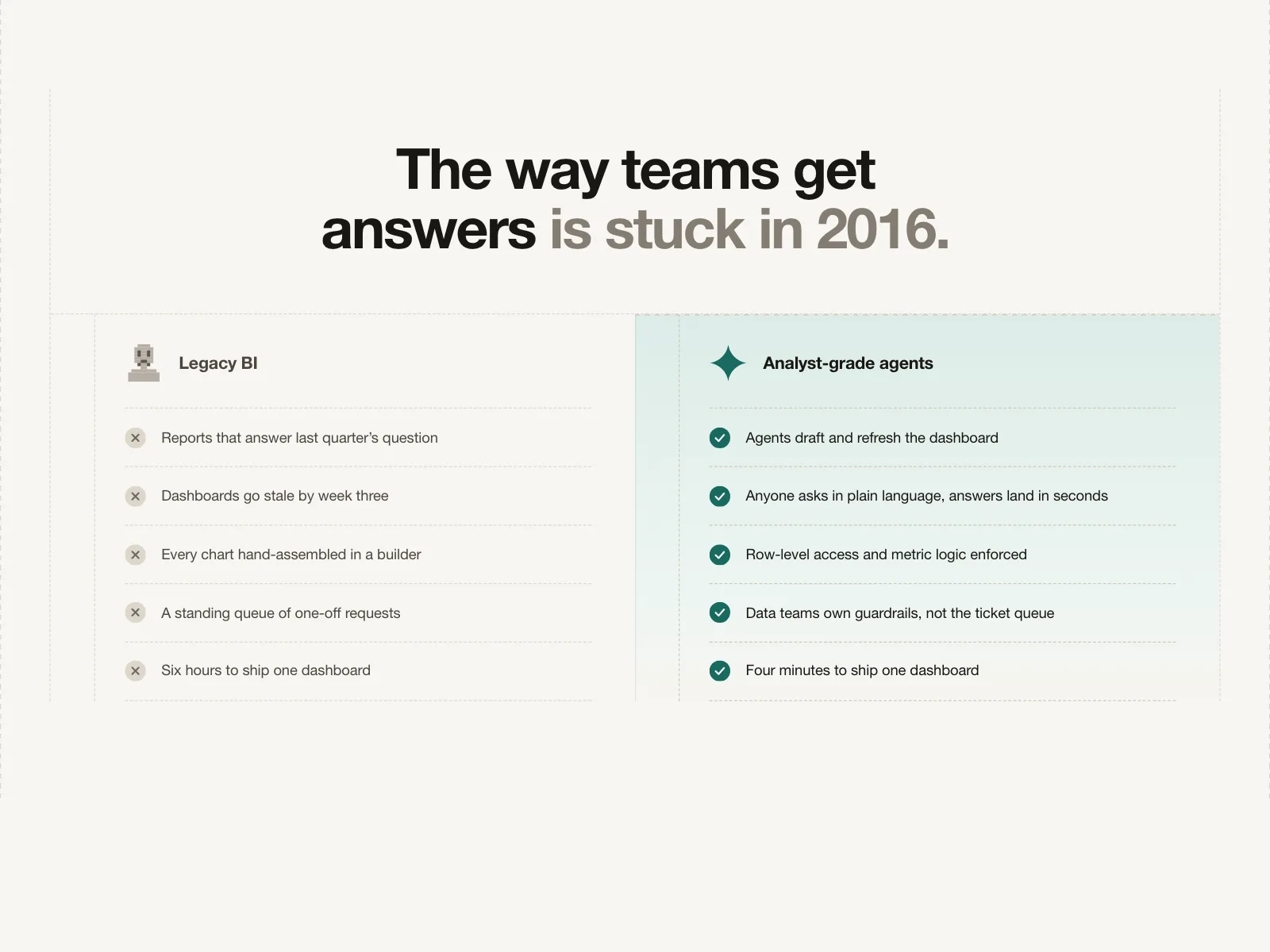
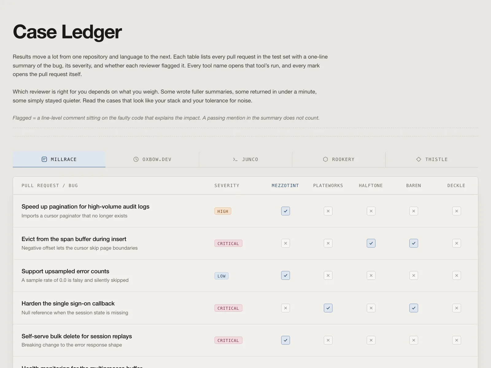
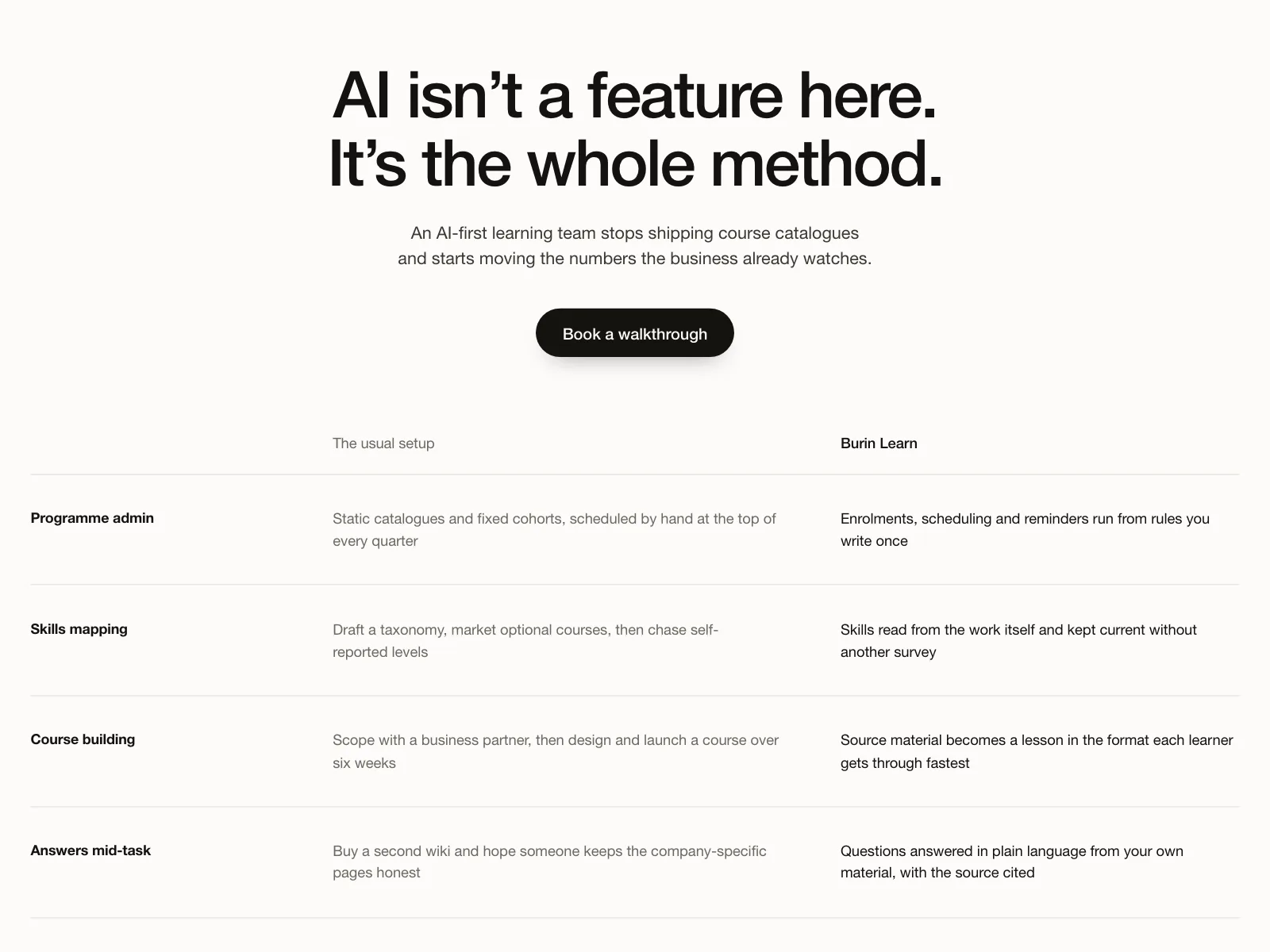
Compare section for Web: comparison section for anneal.dev, an incident-response platform arguing the alert is the easy part.
Style: editorial serif headline on ice-blue off-white, crimson and amber severity accents, dark green button.
Layout: two rounded panels side by side.
Components: scattered overlapping alert toasts with Urgent and Elevated badges, incident card with Start response button, bot summary card, status-page banner with service chips.
Vibe: calm, credible, devops SRE.