About this design
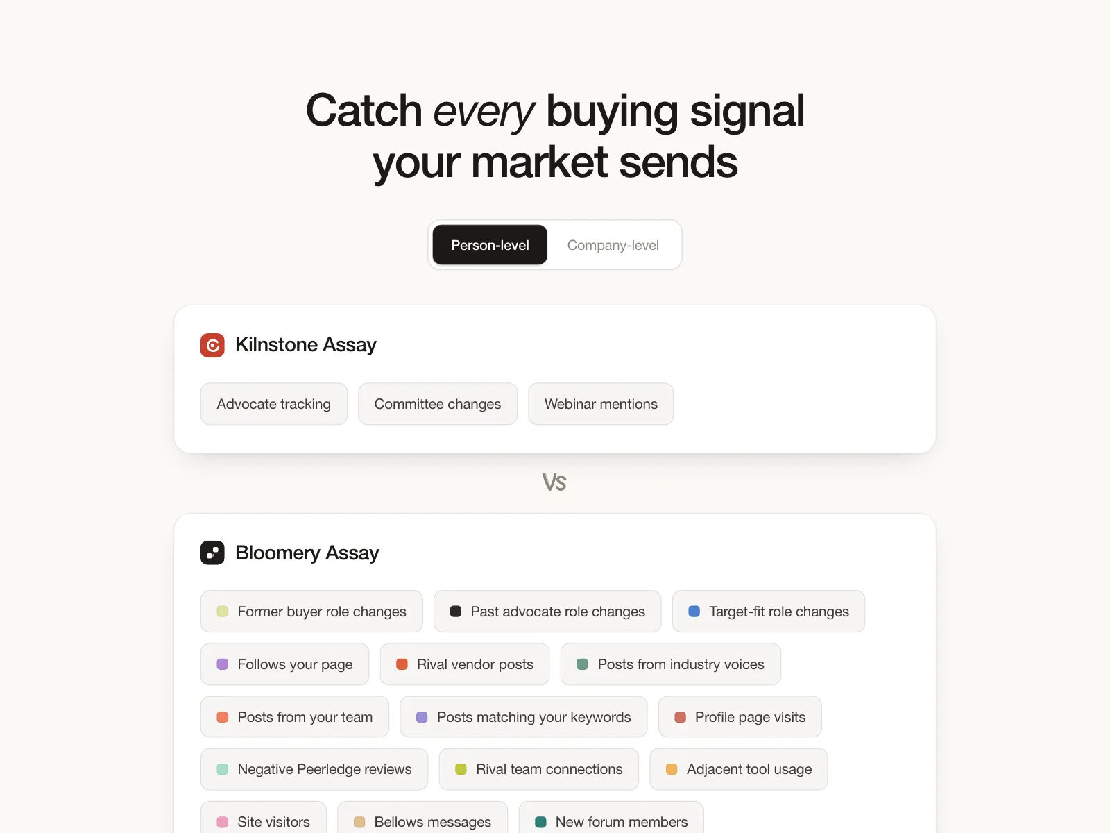
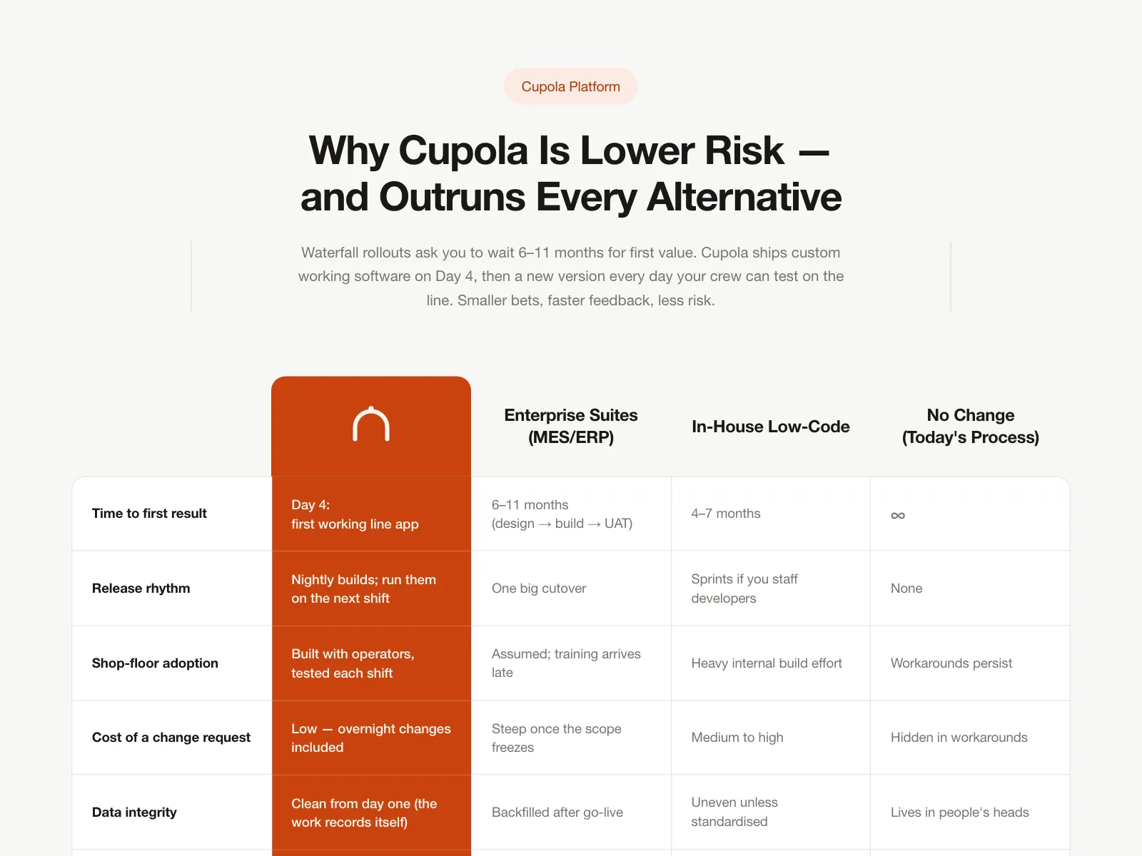
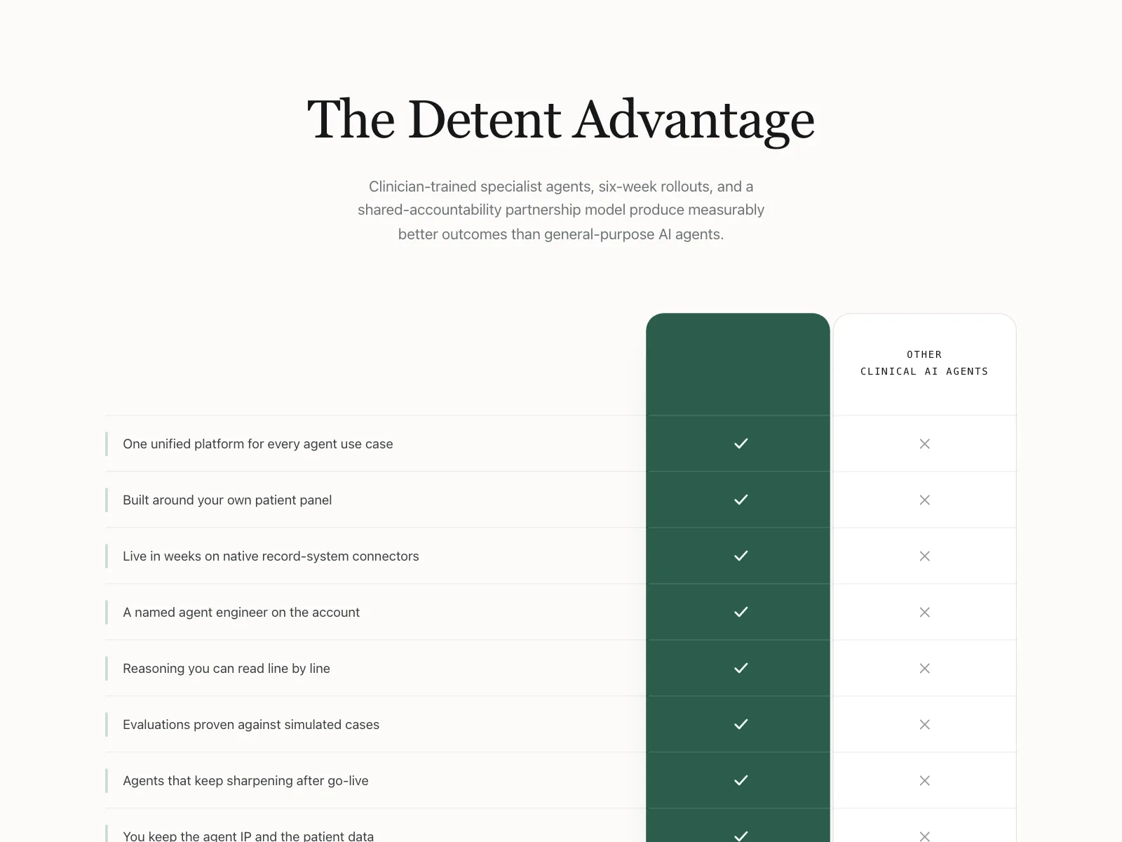
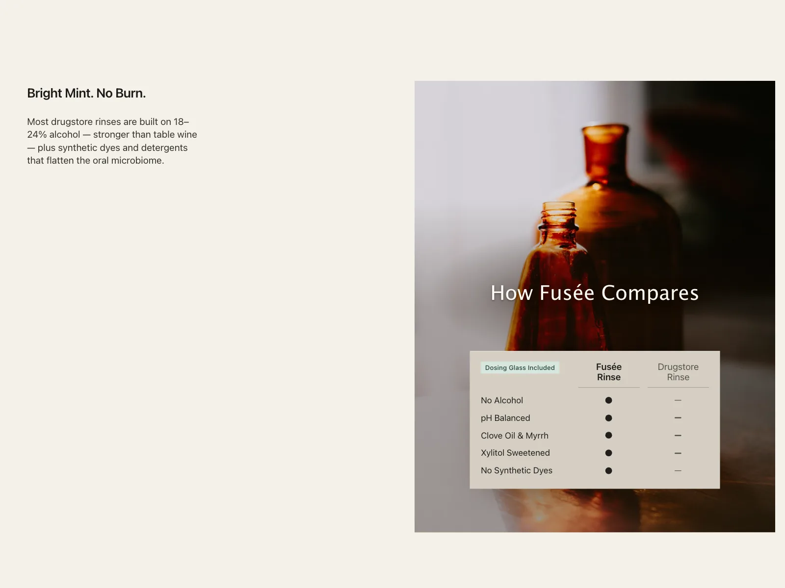
Head-to-head comparison for Tuyere, a corporate card and spend platform, versus Cindermark on unlimited vendor cards and custom ledger fields.
- Style
- minimal light theme, clean neutral white canvas, black sans headline, green tick and rust cross accents.
- Layout
- left-aligned headline above a slim three-row table.