About this design
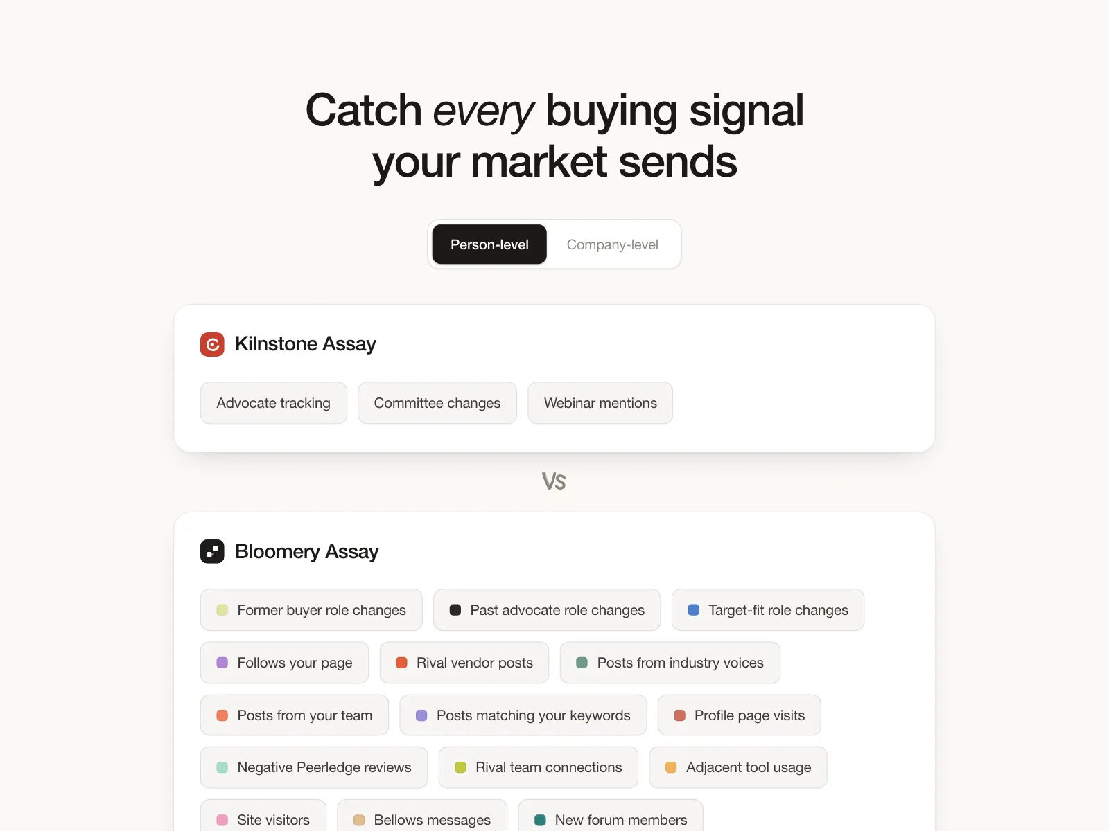
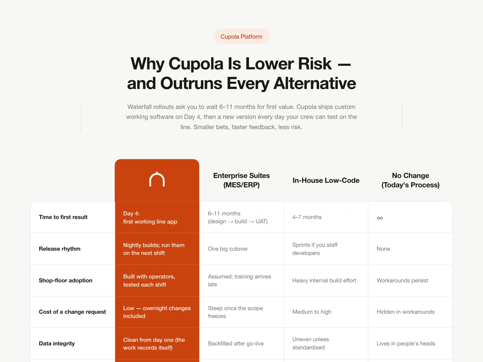
Benchmark case ledger for Mezzotint, scoring AI code reviewers on whether they flagged the faulty line.
- Style
- editorial light theme, cool blue-tinted grey canvas, black display headline, monospace labels, colour-coded severity pills.
- Layout
- intro copy above a repo tab bar and a results table.