Trigpoint

Table section#12 of 30Mobile

About this design

Table section for Mobile: paired-watch comparison for Trigpoint, a running wearable app, tabling watch-plus-phone features against watch-only.

  • Style: editorial minimal, light cream theme, black and taupe with rust-orange check accents, letterspaced uppercase headings.

  • Layout: centered feature list flanked by two status columns under a segmented toggle.
  • Components: Watch+Phone/Watch Only segmented control, device icons, check and cross badges, explainer paragraph, full-width NEXT button.

  • Vibe: calm, tactile — fitness wearable.

More Table sections

View all 30
Table
Table | Isoline
Table
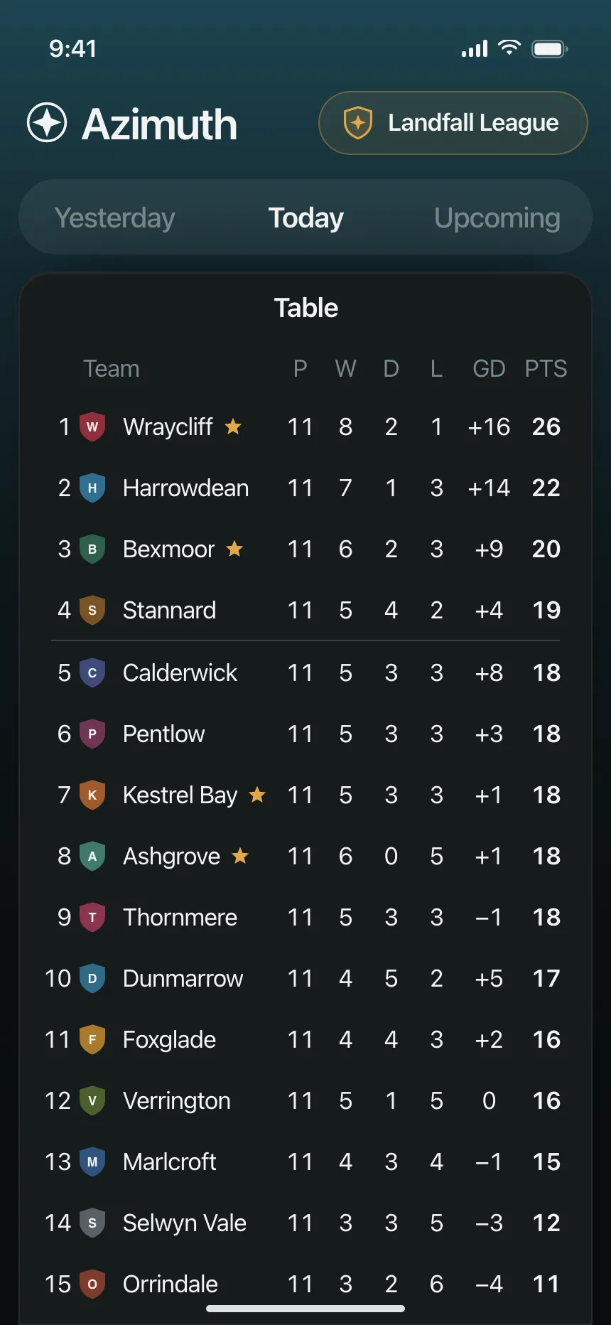
Table | Azimuth
Table
Table | Hachure
Table
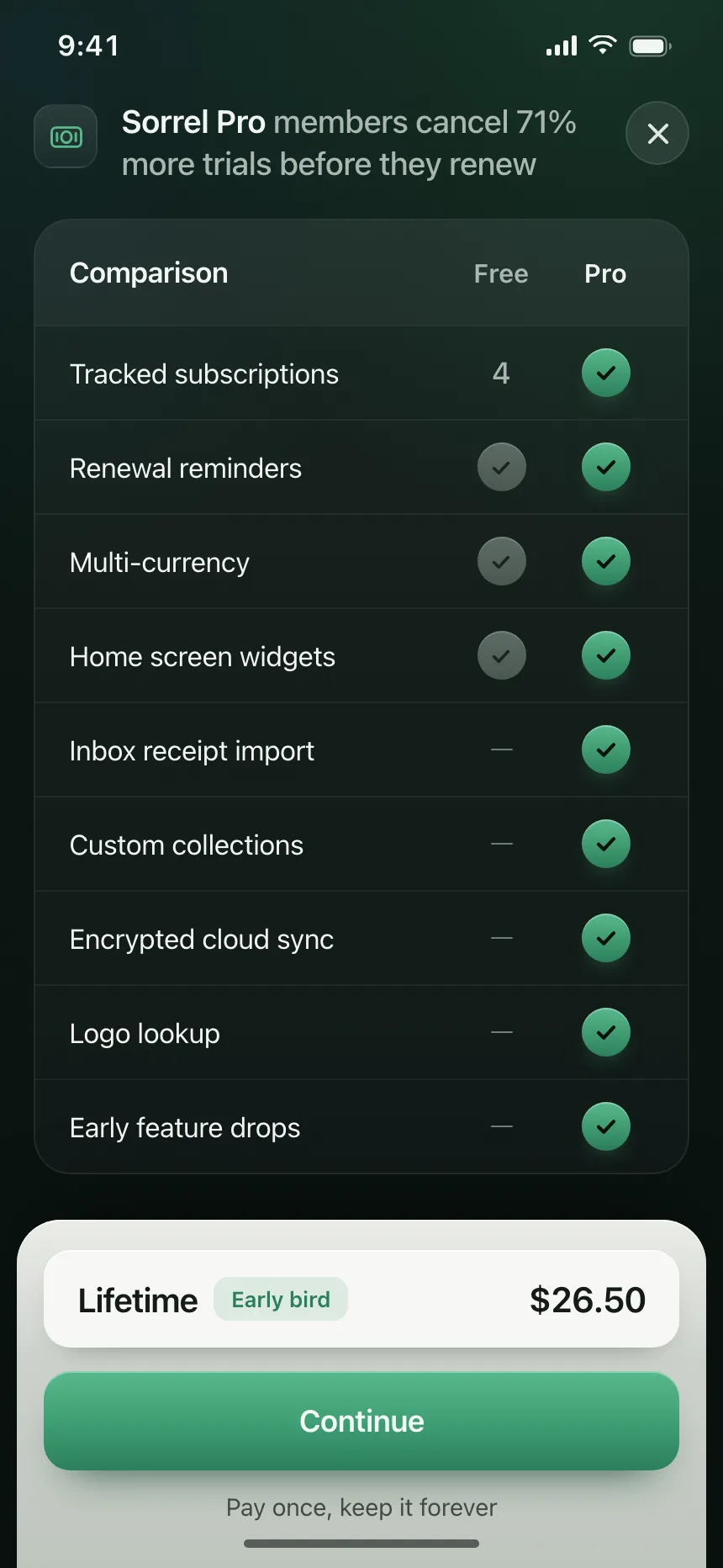
Table | Sorrel Pro
Table
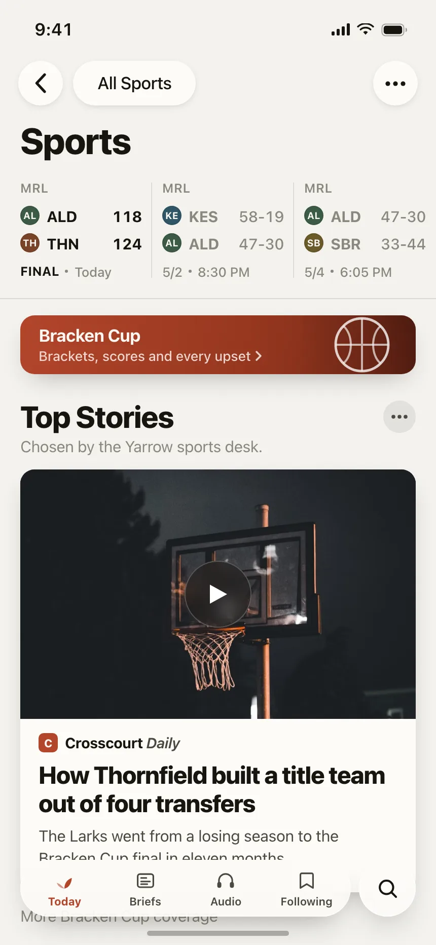
Table | Yarrow
Table
Table | Hazelmoss