Vantry

Compare section#7 of 65Web

About this design

Compare section for Web: why-switch comparison section for Vantry, a corporate spend-card platform.

  • Style: flat dark theme, near-black navy canvas, green check icons against pink cross icons, bold white display headline.

  • Layout: centered headline over a split two-column advantages table.
  • Components: dual-column comparison card, circular check/cross badges, row dividers, brand-vs-others column headers.

  • Vibe: sharp, confident, B2B fintech.

More Compare sections

View all 65
Compare
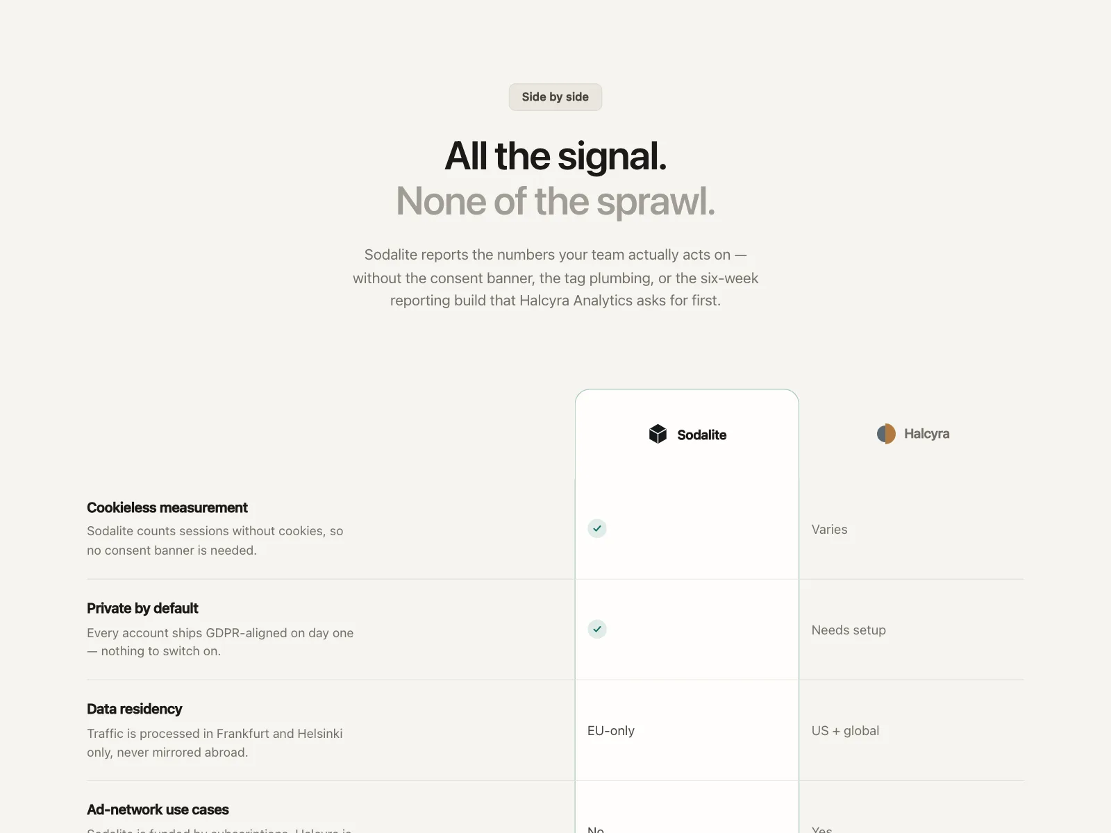
Compare | Sodalite
Compare
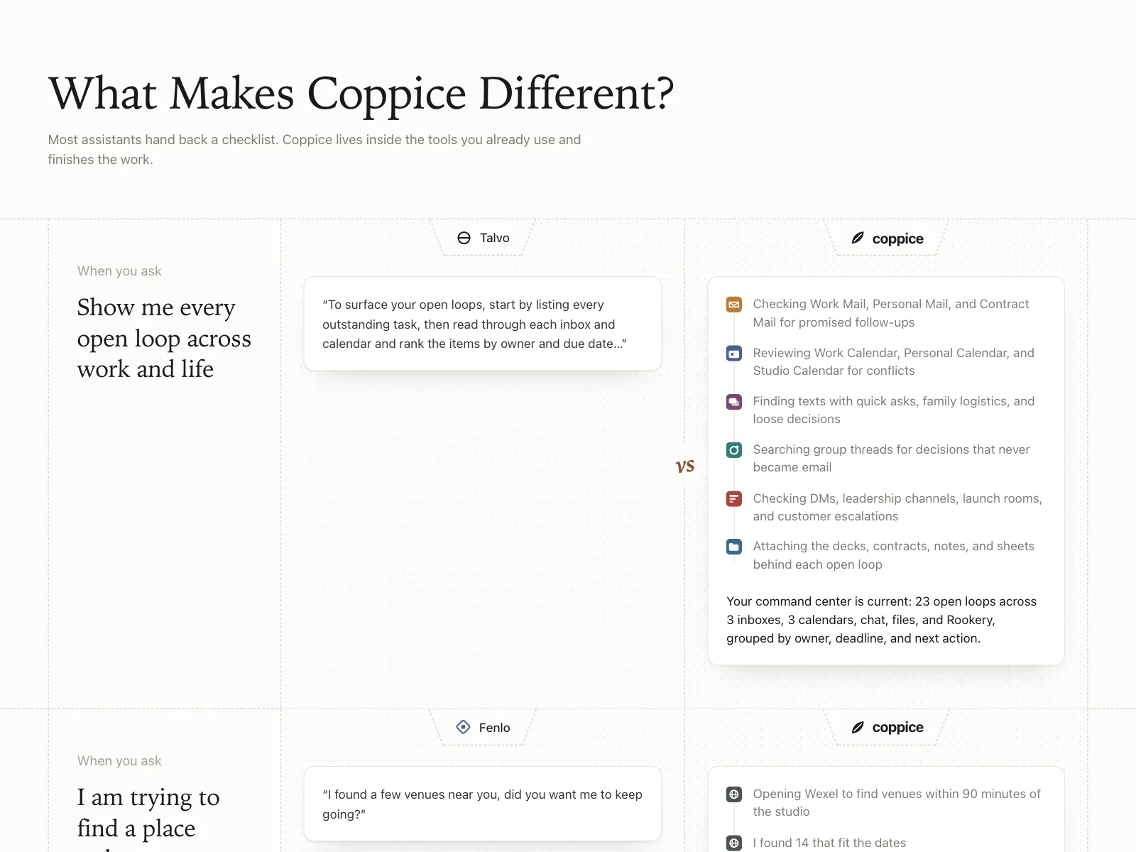
Compare | Coppice
Compare
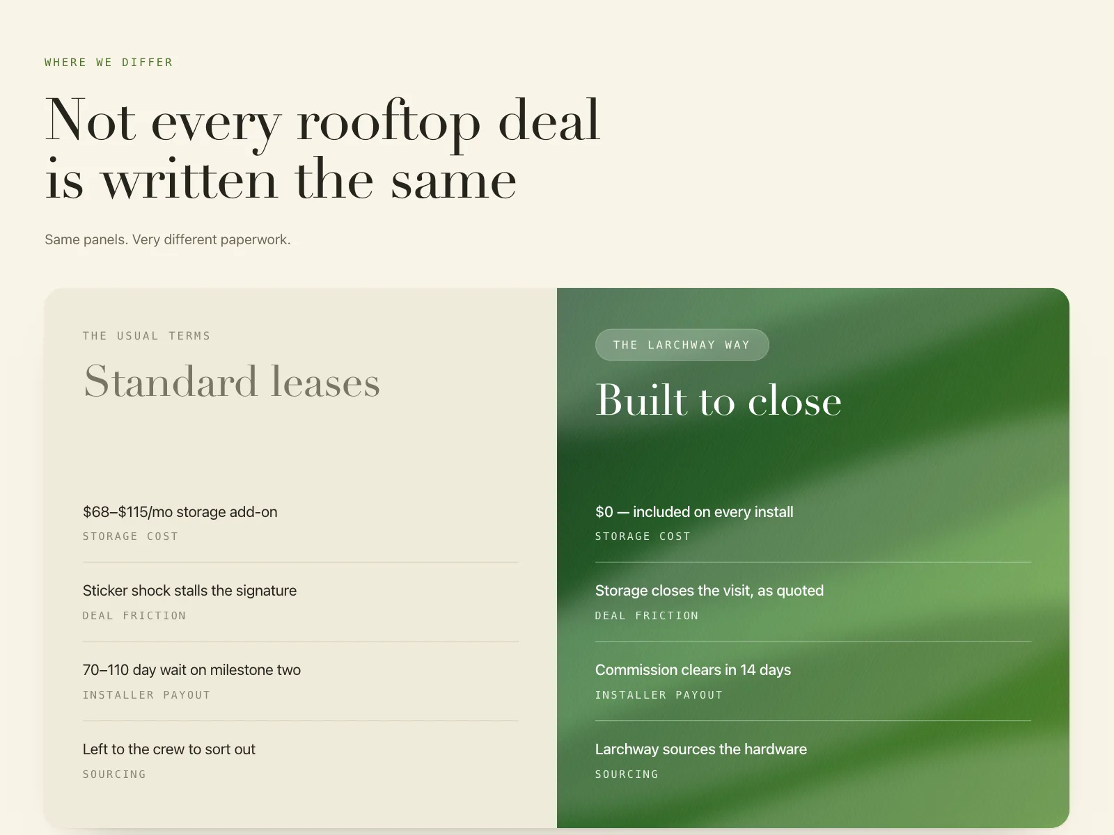
Compare | Larchway
Compare
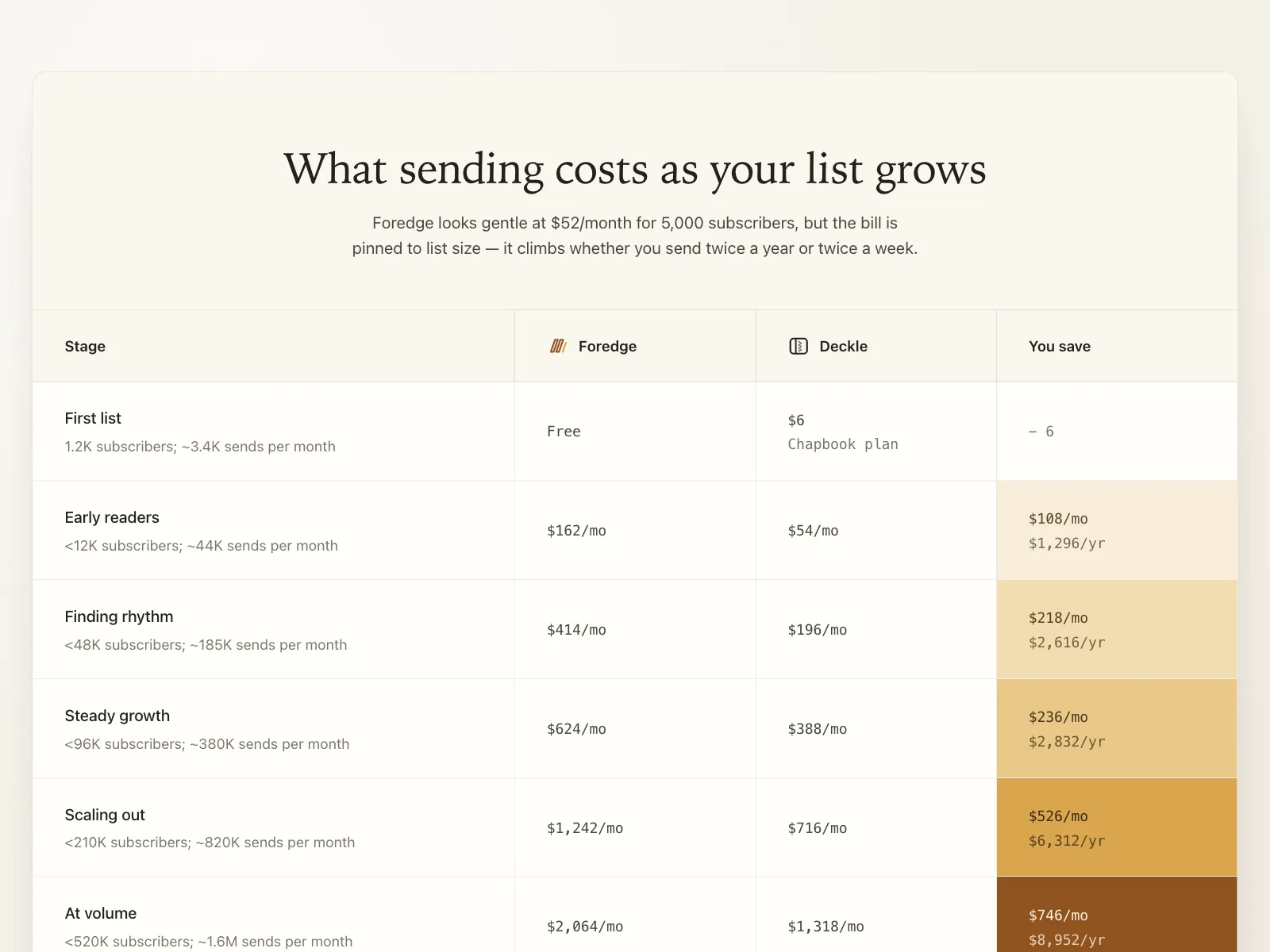
Compare | Deckle