About this design
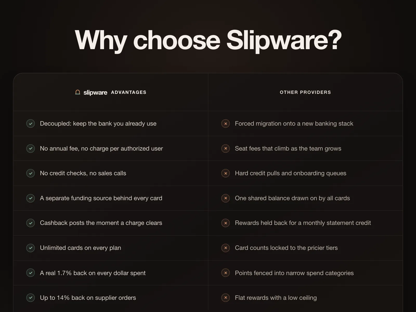
Comparison section for Quarterbind, a business banking account pitching quarterly re-rated limits against frozen legacy accounts.
- Style
- dark theme, near-black canvas with faint grid, cream comparison card, mixed serif-italic and bold sans headline, green ticks.
- Layout
- centred hero above a two-column card split down the middle.