Cobalt

Compare section#8 of 31Mobile

About this design

Compare section for Mobile: cobalt's 'How is Cobalt different from Yonder?' screen, a grouped table checked against Yonder Premium on 14 Mar 2026.

  • Style: near-white page, teal accent, tinted own column against a grey rival column.

  • Layout: 430px iOS screen, short hero paragraph.
  • Components: sticky table header with brand logos, grouped rows with tick and dash marks, Start free bar.

  • Vibe: analytical, transparent, table-first — project tool comparison.

More Compare sections

View all 31
Compare
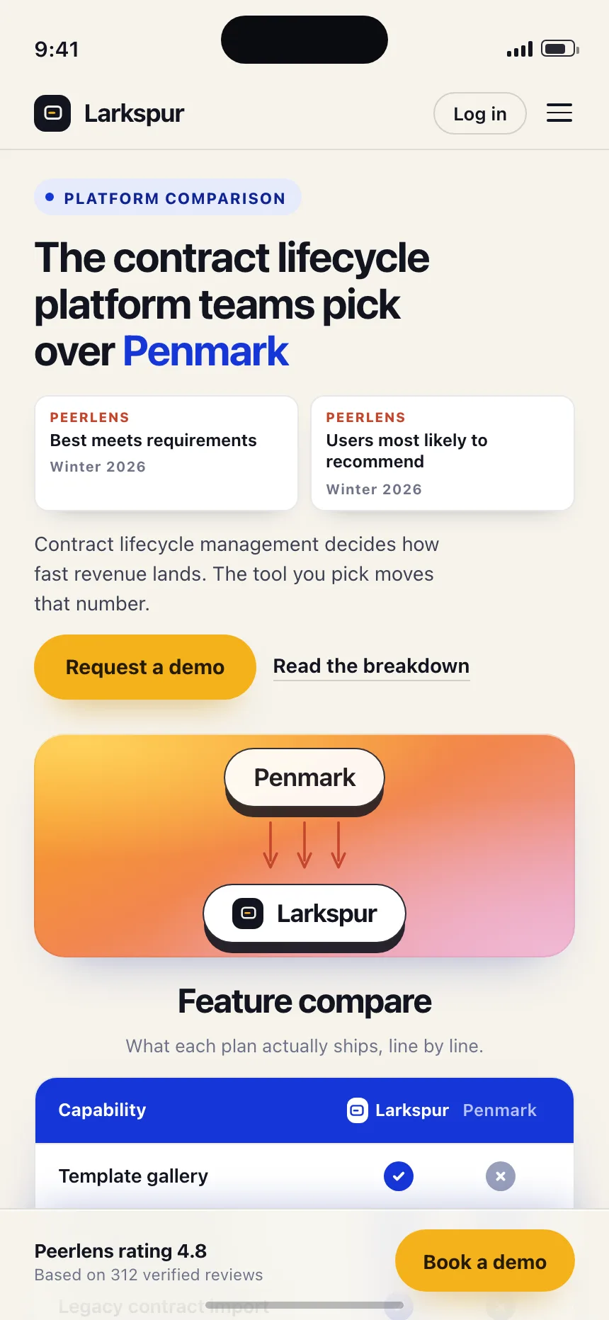
Compare | Larkspur
Compare
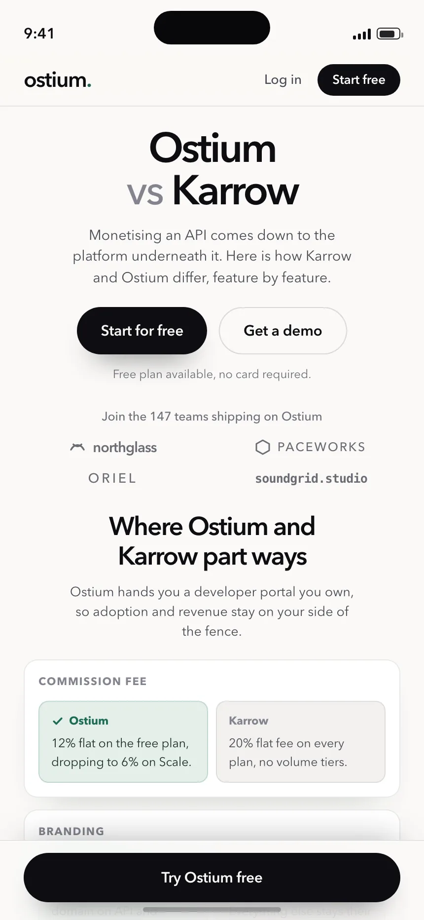
Compare | Ostium
Compare
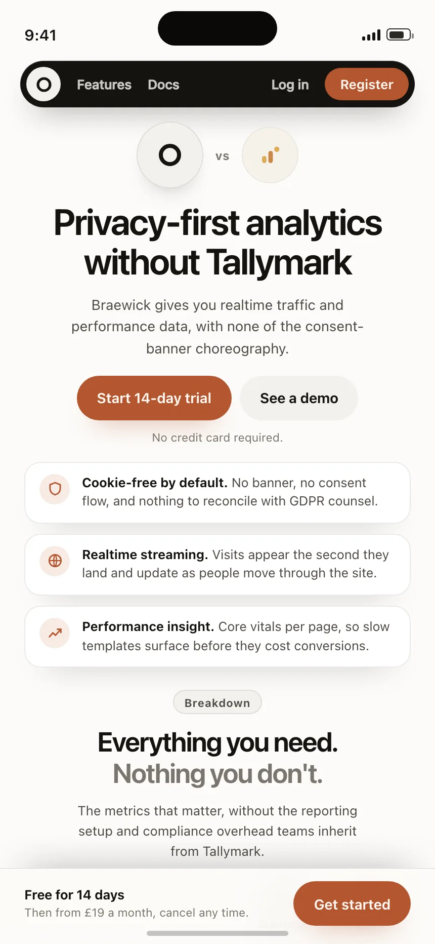
Compare | Braewick
Compare
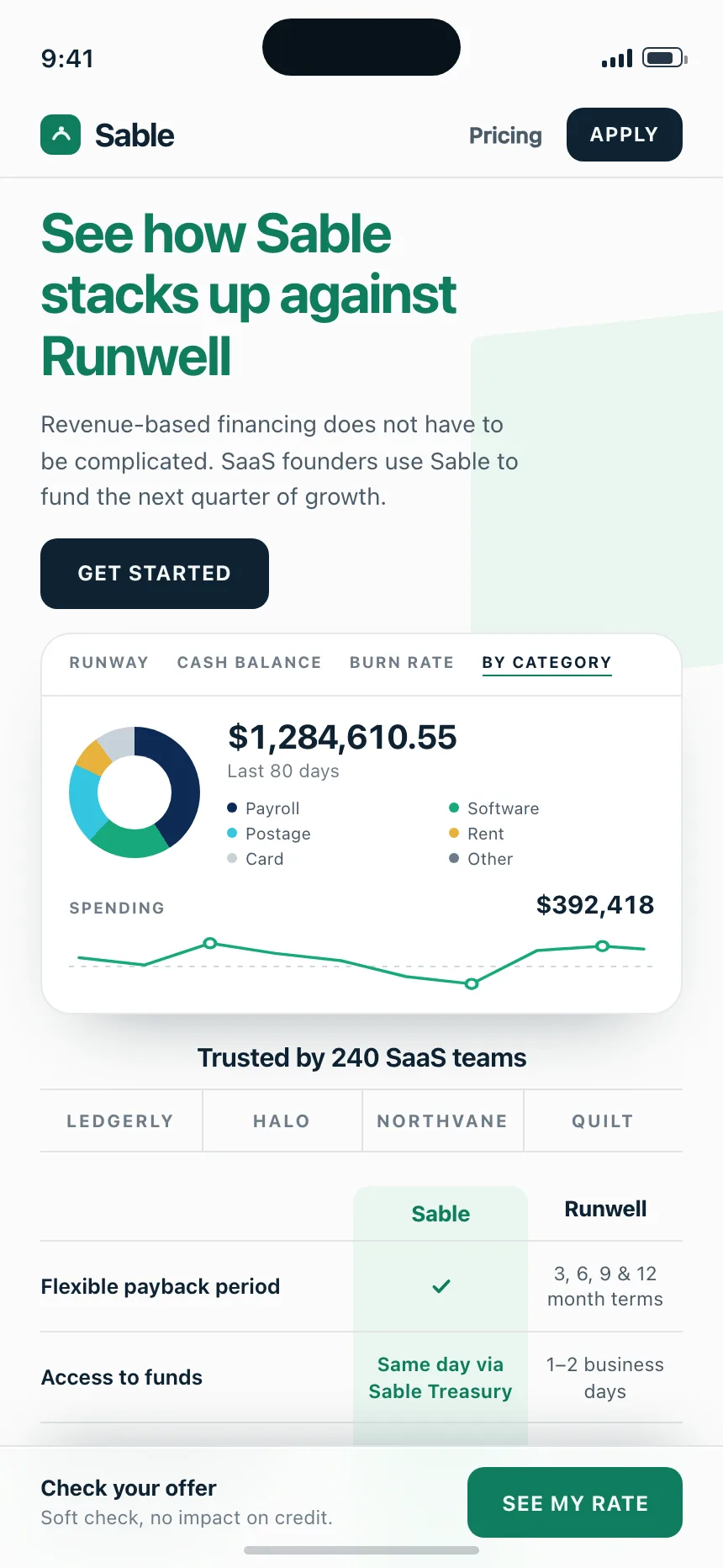
Compare | Sable
Compare
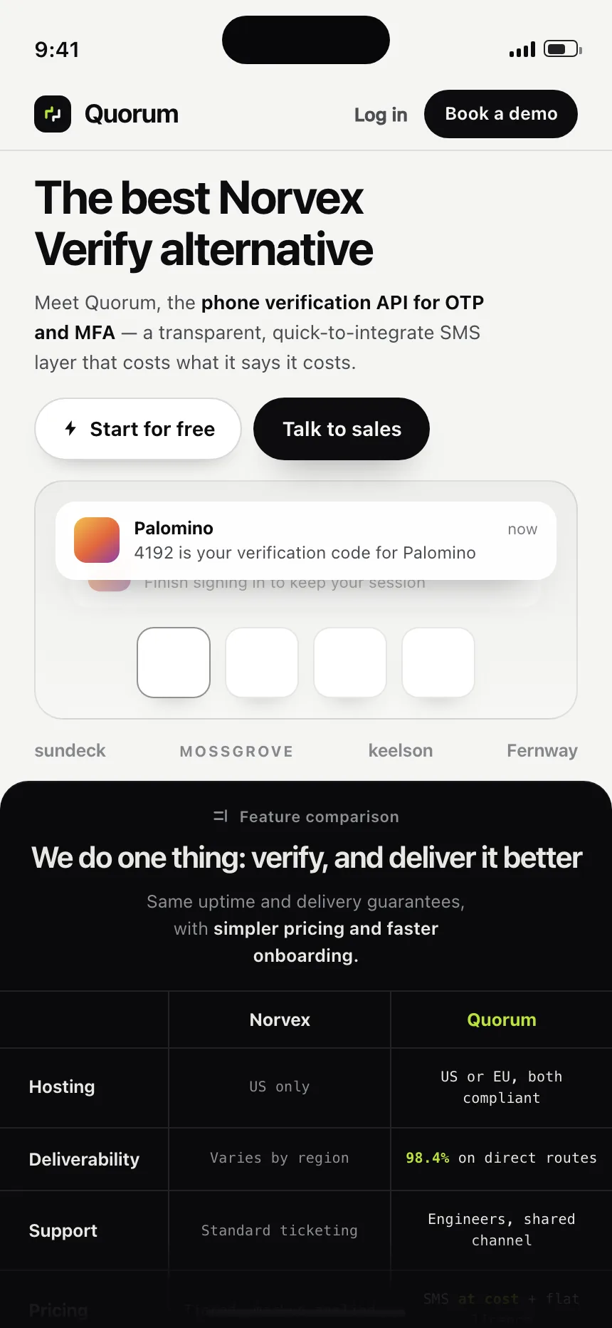
Compare | Quorum
Compare
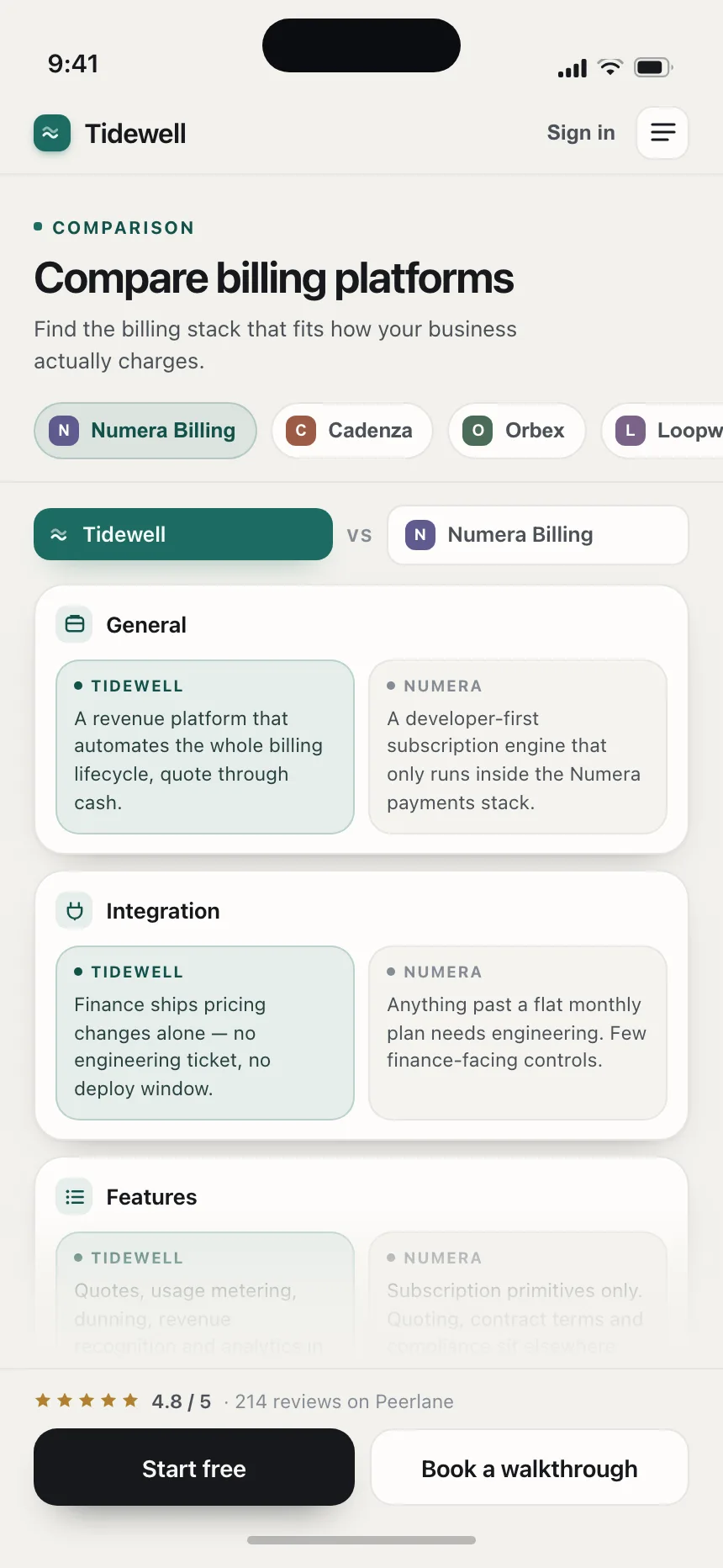
Compare | Tidewell